

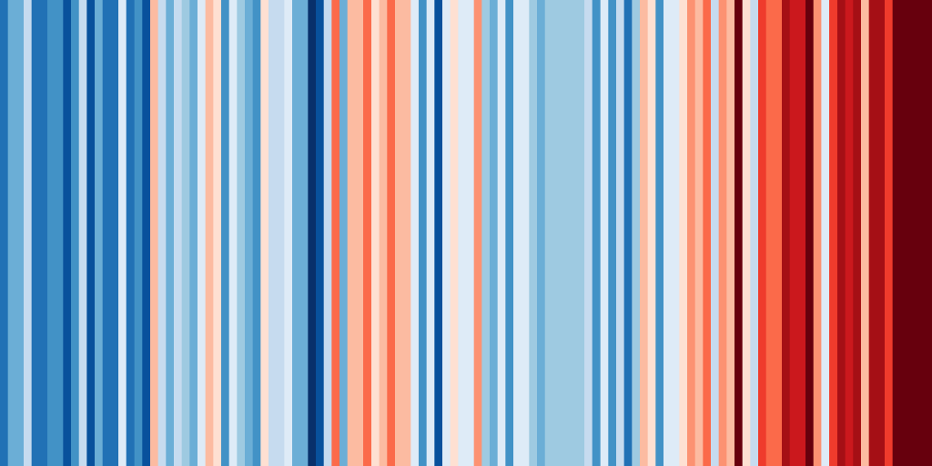
Here is a surprising as well as simplistic graphic reproduction that shows the impact of climate change on the Earth’s temperature.
How many times have we heard in recent years that the record heat of the previous year was beaten? At first glance it may seem like a hoax, but software developed by English researchers at the University of Reading shows us the impact of “climate changes” on our planet.
The image highlighted in this article is illustrative from this point of view. Clicking on the website #ShowYourStripes you can easily download an image that looks a bit like a barcode, with a brilliant intuition: the bands unfold from a cold color, close to blue – blue, until you get to a reddish color. This trend shows us how the global temperatures recorded between 1850 and 2018 are constantly increasing.
To make the result more robust, the researchers concentrated the results at a geolocal level in the period between 1901 and 2018. It is natural to point out that the increase is generalized at a global level, but it is reasonable to assume the differences given by the microclimate at a local level. We observe below how global warming is not saving Italy too.
Below are the temperatures recorded in Greece, a country that, like Italy, overlooks the Mediterranean.
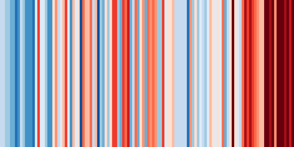
We therefore note that Spain has also experienced a considerable increase in temperatures over the period 1901-2018, albeit in a different way.
